
Artist-made notebooks · 500+ exclusive covers · Every book helps fund education
0%

Hand lettering looks effortless on a finished page. The right notebook helps make that practice more consistent. Paper tooth, ink bleed, binding, and page size all affect how a brush pen moves. A nib that glides beautifully on one sheet may feather on another. Small details matter.

Grand View Research estimated the global stationery products market at USD 146.78 billion in 2023, with projected growth through 2030. The report covers a broad category, not lettering notebooks alone, so it cannot identify a single best paper. Still, it shows how many products compete for artists’ attention. Lettering artist and author Martina Flor describes lettering as “the art of drawing letters.” That simple idea points back to practice: a useful notebook should support repeated strokes, not just look attractive on a desk.

Choosing among Hand Lettering Art Notebooks means checking the details against your tools. Test whether marker ink shows through, whether pencil guidelines erase cleanly, and whether the binding stays open near the center. Look closely at the paper under your usual lighting. A smooth surface may suit fineliners, while a little texture can offer more control with some pens. There is no perfect notebook for every hand. I still find that a promising paper sample can behave differently after several layers of ink. That is worth remembering. This guide compares practical features, so you can choose a notebook that fits your lettering style, budget, and everyday routine.
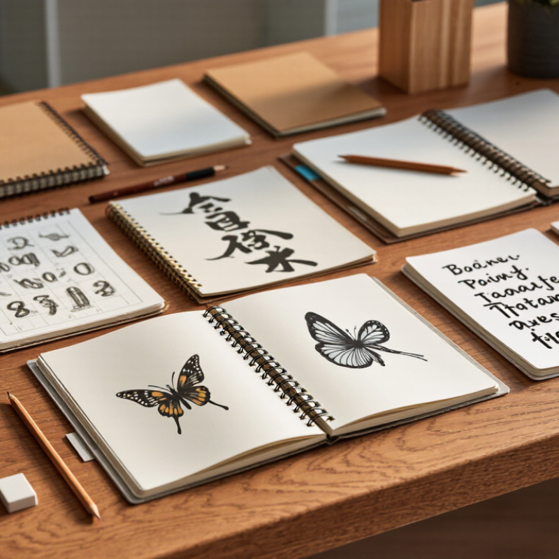
How to Choose the Best Hand Lettering Art Notebooks?

Understanding the Purpose of Hand Lettering Art Notebooks

A hand lettering notebook is more than a place to make attractive pages. Its purpose is to give practice a clear home. Dedicated pages let you compare letter shapes, test spacing, and notice which pen marks feather on the paper. A small grid can help keep letters steady; blank space suits flourishes and larger layouts. Choose a notebook around the work you actually do, not just its cover. Short daily drills need room for repetition. Finished quotes need margins and enough space to plan line breaks.

Practice should feel manageable. The National Literacy Trust’s 2023 survey of 64,066 UK children and young people found that 34.6% enjoyed writing in their free time. That survey was not about lettering notebooks, so it cannot prove that a particular format builds motivation. Still, it highlights why a welcoming place to write may matter. Look for paper that handles your usual tools, opens flat, and allows visible progress from page to page. Keep early samples. They may look uneven. That is useful evidence: compare the slant, pressure, and spacing after a few weeks, then adjust one habit at a time. A beautiful notebook can still frustrate you if the paper bleeds through.

Comparing Paper Types, Weight, and Texture

The best lettering notebook depends on how your tools meet the page. Paper weight is measured in grams per square metre (g/m²); ISO 536:2019 defines the method for determining this grammage. For light practice with pencil or fine liners, around 90–120 g/m² is often practical. Brush pens and wetter inks usually benefit from heavier sheets, such as 160–200 g/m², though weight alone cannot prevent bleeding. Paper sizing and coating matter too. Test a small stroke before committing to a full page.

Texture changes both control and appearance. Smooth paper lets pointed nibs glide and keeps fine strokes crisp. A lightly textured surface can give pencil and broad nibs more grip, but deep tooth may catch delicate nibs. ISO 8791-2:2013 describes a Bendtsen method for measuring paper roughness, a useful reminder that texture can be assessed rather than guessed. Still, a technical reading cannot tell you how a page feels under your own hand. I sometimes choose a sheet that looks ideal, then find it slows my lettering.

Tips: Make a small sampler: write a thin upstroke, a heavy downstroke, and a filled swatch. Check the reverse for show-through and bleed, then note the paper weight and finish. Compare sheets under the same ink and drying conditions; otherwise, the test gets muddy.

Evaluating Notebook Size, Layout, and Binding

Notebook size affects both lettering scale and hand movement. A compact format fits in a bag, but narrow pages can crowd flourishing strokes. A larger page gives capitals room to breathe and makes spacing easier to judge. Try a few practice words near the edges before choosing. Awkward margins matter.

Layout should support the way you actually practice. Blank pages allow free composition, while dots or faint grids help keep letters aligned. Ruled lines can guide consistent height, though dark rules may compete with delicate strokes. Check whether the spacing suits your preferred nib and letter size. A quick test helps: draw a few guidelines, then write a lowercase alphabet across the page.

Binding affects comfort more than it first appears. A notebook that lies flat keeps the writing surface steady, especially near the center fold. Spiral bindings open widely, but the coil can press against your wrist. Sewn bindings often feel smoother, though some need gentle handling before they stay open. Glue-bound pages may resist flattening. Test the notebook on a desk, and notice where your hand rests. Small details can change a long practice session. I would not assume one binding works for every desk or grip.

Matching Notebook Features to Lettering Tools and Techniques

How to Choose the Best Hand Lettering Art Notebooks?
Matching Notebook Features to Lettering Tools and Techniques

Choose paper for the tool, not just the cover or page count. Brush pens often need smooth, heavier sheets; around 100–120 gsm is a useful starting point for reducing show-through. Pointed nibs need a surface that guides the tip without catching it. For pencil layouts, a little tooth helps lines stay visible. ISO 536:2019 provides a standardized method for measuring paper grammage, while ISO 8791-4:2021 measures surface roughness. These technical standards make paper specifications easier to compare, though they cannot predict how every ink will behave. Test a sample page with your actual pen.

Binding matters, too. Lay-flat pages make long swashes easier, while a firm backing helps with practice away from a desk. Check opacity by placing dark strokes on one side and reading the reverse. A small amount of ghosting may be fine; bleeding through can waste usable pages. There is no perfect sheet. A notebook that suits a flexible brush pen may feel too slick under a pencil, and that trade-off is easy to miss.

Tips: Try your heaviest ink first. Let it dry fully, then check the reverse for feathering, bleed-through, and smudges. Keep one test page.

How to Choose the Best Hand Lettering Art Notebooks? — Matching Notebook Features to Lettering Tools and Techniques

Lettering tool or technique Notebook features to look for Useful paper characteristics Why the match matters Practical check before buying
Brush pen lettering Smooth, sturdy pages; a surface that resists wear; enough room for pressure transitions Medium-to-heavy paper, often around 100–160 gsm; smooth or lightly textured finish Smooth paper helps flexible brush tips glide and can reduce snagging. Heavier stock is generally more resistant to show-through, though ink and pressure also affect results. Make a few upstrokes and pressure strokes on a sample page. Check for scratchiness, feathering, and marks visible on the reverse.
Pointed-pen calligraphy with dip or fountain pens Very smooth, well-sized paper; pages that stay flat; a binding that allows comfortable writing Paper around 90–120 gsm can work well; smoothness and ink behavior are often more important than weight alone Fine nibs can catch on rough fibers, while absorbent paper may cause ink to spread or feather. Paper performance varies with ink, nib, and writing pressure. Test thin upstrokes and small letters with the intended nib and ink. Look for clean hairlines, feathering, and bleed-through.
Broad-edge pen or marker lettering Flat, even pages; a smooth surface; enough page area for broad strokes and practice alphabets Medium-weight paper with a consistent finish; choose a heavier option if the chosen ink is wet Even paper helps keep broad strokes consistent. Wet inks may show through or bleed, so paper weight alone does not guarantee suitability. Draw several parallel strokes and leave a small ink swatch to dry. Check both the front and back of the page.
Alcohol-marker lettering and blended color Marker-friendly or bleed-resistant pages; a protective sheet or sacrificial page; a binding that opens flat Specially treated marker paper or heavier, coated stock; follow the paper’s stated marker-use guidance Alcohol markers commonly bleed through ordinary notebook paper. A coated surface can also change drying time and blending behavior. Test the exact marker colors and layering method. Place a spare sheet beneath the page and check for bleed-through and smearing.
Colored-pencil lettering and shading Subtle tooth for pigment grip; firm pages that tolerate repeated layering Medium-weight paper with a lightly textured surface; heavier drawing paper may suit intensive layering A little texture can help colored-pencil pigment adhere, while a very smooth surface may fill quickly during repeated layers. Build several layers on a test area. Check whether the paper accepts more pigment without becoming rough or damaged.
Graphite pencil sketches and layout guides Pages that erase cleanly; light-colored paper; a format suited to planning compositions Light-to-medium weight paper with a smooth or slightly textured finish Graphite needs a surface that supports clear lines and erasing. Excessive rubbing can still roughen or crease lightweight pages. Draw a few guide lines, erase them, and inspect for smudging, visible impressions, or surface damage.
Water-based markers and watercolor lettering Water-resistant or mixed-media pages; a sturdy binding; pages that can handle limited moisture Heavier mixed-media paper, commonly around 200–300 gsm for more water-intensive work Water can make ordinary notebook paper buckle or distort. Heavier paper generally handles moisture better, but results depend on sizing and the amount of water used. Apply a small wash and allow it to dry. Check for buckling, pilling, color spread, and whether the page remains usable.
Practice drills and lettering worksheets Guidelines, grids, dot grids, or removable practice sheets; enough writing space; a comfortable page size Choose paper based on the tool used for drills; smooth paper is a versatile starting point for many pens Guides help maintain consistent letter height, slant, spacing, and baseline alignment. A notebook can be used alongside printable practice sheets. Confirm that the ruling suits the lettering scale and that the page layout leaves room for notes and repeated attempts.

Selection tip: Paper weight is measured in grams per square meter (gsm), but weight alone does not determine performance. Test the notebook with the exact pen, ink, marker, or paint you plan to use whenever possible.

Choosing a Notebook for Your Skill Level and Budget

For a beginner, a modest notebook is usually enough to build steady lettering habits. Choose smooth paper that lets brush pens glide without snagging. Rough fibers can split fine strokes or make ink spread. Keep it simple. A small format also feels less intimidating, and it takes up little desk space.

If you already control pressure and stroke direction, compare paper performance with the tools you use most. Brush pens need pages that resist bleeding and show-through; pointed nibs may work better on smoother sheets. Paper weight, often listed in gsm, offers a useful clue, but surface finish matters too. Test before buying. Try a few strokes on a sample page, if available, and check the reverse for ink marks. More pages are not a bargain if you avoid using them.

Set a budget around your practice, not an imagined future skill level. A sturdy binding and paper that suits your ink may matter more than decorative covers. Larger notebooks give you room for long flourishes, while compact ones are easier to carry. I may be overvaluing paper quality here; consistent practice matters more than a perfect surface. Leave a few pages for testing, and note which pens feather or bleed.

FAQS

What paper weight works for lettering practice?

Paper around 90–120 gsm suits pencils and fine liners. Brush pens often need 160–200 gsm, but weight alone cannot stop ink bleeding.

Is smooth paper always better for brush pens?

Smooth paper helps brush pens glide and keeps fine strokes crisp. Some sheets feel too slick, though. Test your pen first.

What texture should I choose for pencil lettering?

A lightly textured page gives pencil lines more grip and visibility. Deep texture may catch delicate nibs or interrupt fine strokes.

How can I test a notebook before using it?

Write a thin upstroke, a heavy downstroke, and a filled swatch. Check the reverse after the ink dries.

What should I look for on the reverse of a test page?

Look for show-through, feathering, bleed-through, and smudges. A little ghosting may be acceptable. Bleeding wastes pages.

Does heavier paper guarantee that ink will not bleed?

No. Paper sizing and coating also affect ink behavior. I have picked heavy sheets that still disappointed me.

Why does notebook binding matter for lettering?

Lay-flat pages make long swashes easier. A firm backing helps when you practice away from a desk.

Should I compare paper using different pens and inks?

Compare sheets with the same pen, ink, and drying conditions. Otherwise, the results get muddy. Keep one test page.

Conclusion

Choosing the right Hand Lettering Art Notebooks starts with understanding how you plan to use them, whether for daily practice, finished illustrations, or experimenting with new techniques. Paper quality matters: consider its weight, texture, and ability to handle your preferred pens, pencils, or brush tools without unwanted bleeding or feathering. A smooth surface may suit fine details, while a lightly textured page can offer a different feel and more control.

Notebook size, page layout, and binding also affect comfort and portability. Look for a format that gives your lettering enough room and opens conveniently while you work. Match the notebook’s features to your tools and techniques, then consider your experience level and budget. Beginners may prefer a practical, affordable option for regular practice, while experienced artists may choose paper suited to more detailed or varied work. The best choice is one that supports your creative habits and makes you want to keep practicing.

Oliver

Oliver

Oliver is a professional marketing specialist with a deep understanding of the company’s products, market trends, and customer needs. With extensive experience in content strategy, digital communication, and industry research, he regularly contributes insightful articles to the company’s......